
How to Make an AI-Generated Movie Poster from a Story Idea
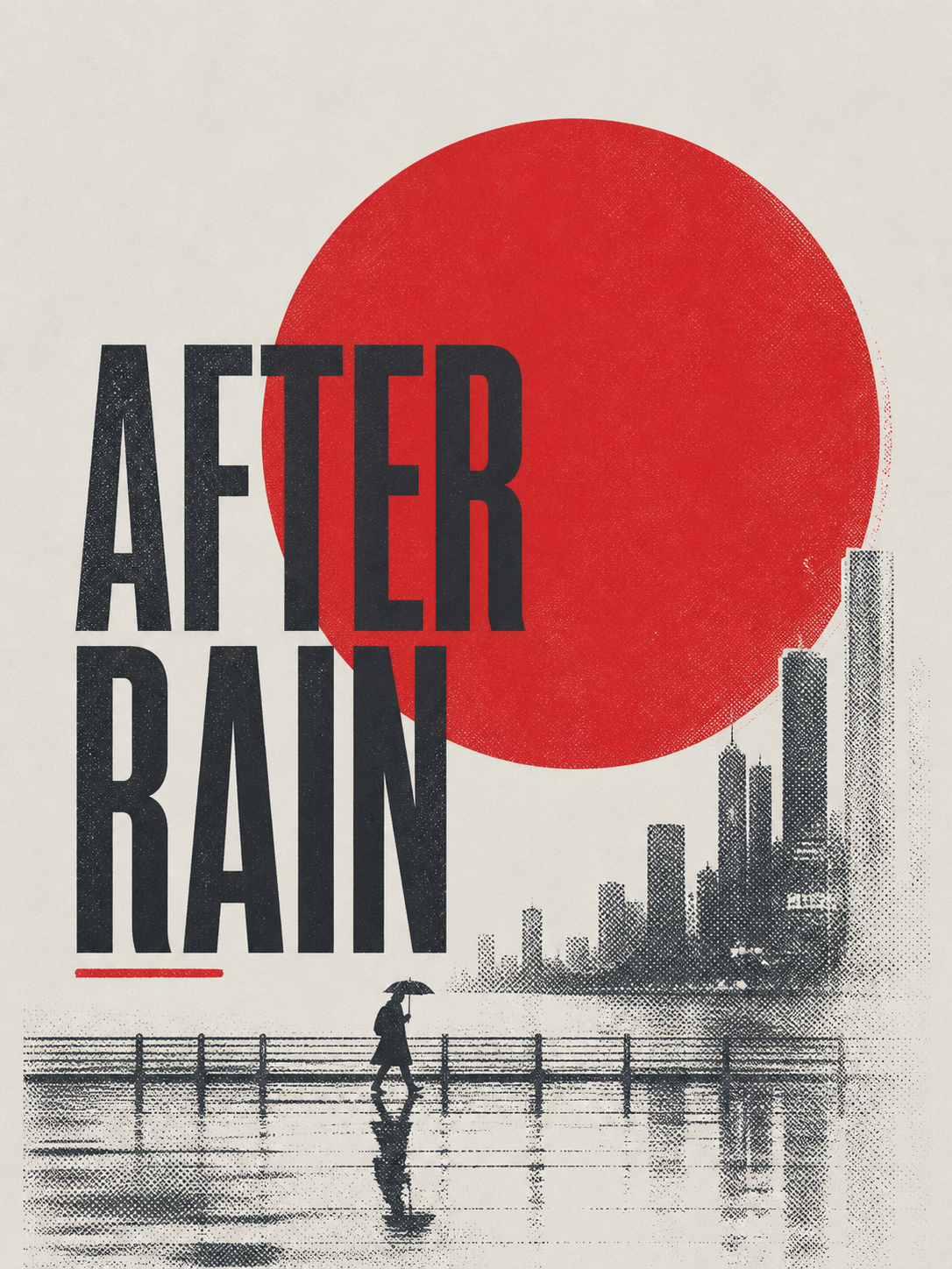
Turn one story idea into a focused poster direction
Enter the title, subtitle, scene, and one red symbol, then review the generated concept for accuracy, continuity, and originality.
Review the quality gate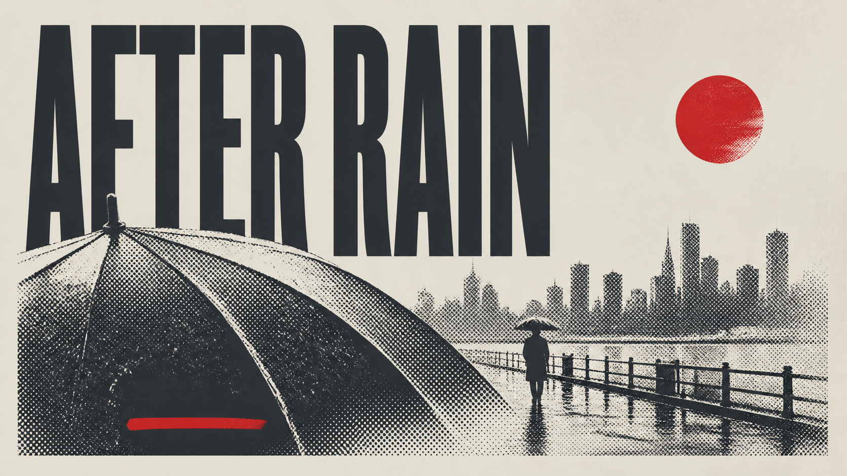
Direct answer
To make an AI-generated movie poster, do not begin with the whole plot. Begin with one visual premise. Choose the image that best carries the film's tension, then define four inputs: title, subtitle, scene, and one symbolic accent. Generate a few focused directions, reject anything generic or derivative, and review the chosen concept for text accuracy, anatomy, visual continuity, originality, rights, and credits.
The poster does not need to explain the story. It needs to make the right person curious about it.
Key takeaways
- Reduce the film to one image and one emotional question.
- Keep the title and subtitle short enough to read in a few seconds.
- Describe the scene precisely, including subject scale, setting, weather, and negative space.
- Use one symbol with a story reason. Decorative clutter weakens the premise.
- Treat generated key art as a direction until text, rights, credits, and release details are reviewed.
What makes a movie poster feel intentional
A movie poster feels intentional when every visible choice points toward the same promise. The title, image, scale, color, and symbol do not compete for attention. They create one question in the viewer's mind.
For a quiet story about isolation after a storm, the poster might show a tiny umbrella figure on an empty waterfront beneath a distant skyline. The figure establishes vulnerability. The wet ground and open space establish mood. One signal-red sun can carry a sense of danger, memory, or return.
That is stronger than asking for "an epic cinematic movie poster." Broad style words tell the image model very little about your film. Specific visual relationships tell it what matters.
Choose the right production route
| Starting method | Best when | What you get first | Main risk |
|---|---|---|---|
| Brief-driven AI concept | You have a story and need a visual premise | Original directions built around the scene and mood | Generic, incorrect, or derivative output |
| Template-based poster maker | You have images and need a dependable layout | Editable hierarchy, type, and placement | The chosen layout can lead the concept instead of the story |
| Key-art designer | The film needs a release campaign, many formats, and rights-managed assets | A complete visual system and production judgment | More time, budget, and coordination |
An indie project can use all three. AI can help explore visual premises. A template or layout tool can establish exact typography. A designer can turn the selected direction into release-ready key art and a wider campaign system.
Reduce the story to one visual premise
Write one sentence that describes what the viewer should see, not what happens across the whole screenplay.
Plot summary:
A woman returns to a changing waterfront city after years away and walks through places she no longer recognizes.
Visual premise:
A small umbrella figure crosses a rain-soaked waterfront while a distant skyline disappears into haze.
The second sentence can be composed. It gives you subject scale, action, setting, weather, depth, and mood. It also leaves room for the title.
If the premise still feels generic, ask what only this film would include. It might be a broken neon fish, a red scarf tied to a ferry rail, or a child's paper moon reflected in a station window. The symbol should come from the story rather than from a list of movie-poster trends.
Write the four-field brief
Here is a complete minimal brief:
- Title: AFTER RAIN
- Subtitle: A QUIET WALK THROUGH THE CITY
- Scene: A small umbrella figure on a rain-soaked waterfront promenade with a distant city skyline
- Red symbol: A signal-red sun behind the skyline
The title is short and visually strong. The subtitle supplies tone without retelling the plot. The scene gives the composition one clear subject at a deliberately small scale. The red symbol creates a focal accent and gives the story a question.
Keep the palette and composition constrained. For this direction, off-white, black, gray, and one signal-red accent are enough. Ask for negative space around the title rather than a collage of faces, landmarks, explosions, and atmospheric effects.
The images in this guide are editorial illustrations of the planning process and visual direction, not measured product outputs.
Generate and compare a small set of directions
Use the same brief for the first set so you can compare composition rather than prompt changes. Three or four directions are usually enough to reveal whether the premise works.
Judge each result at two sizes:
- Thumbnail: Is there one clear image? Can you identify the title area? Does the red symbol lead the eye or merely decorate the scene?
- Full size: Are the figure, umbrella, waterfront, reflections, and skyline structurally believable? Is the texture controlled? Are there strange fragments that disappear at small size?
Then make one change at a time. If the figure feels too important, reduce the subject scale. If the title area is crowded, ask for more negative space. If the result resembles generic streaming artwork, remove secondary effects and make the story symbol more specific.
Do not solve a weak premise by adding more names, genre labels, camera terms, or artist references. The next generation should test a clearer decision.
Review the poster before anyone sees it
Text accuracy
Compare every visible letter with the approved title and subtitle. Generated type may contain plausible shapes that are not real words. Do not publish invented credits, festival selections, release dates, ratings, or production-company names. Add verified details through a controlled typography step.
Anatomy and continuity
Inspect faces, hands, feet, umbrellas, reflections, vehicles, architecture, and horizon lines at full size. In a rainy scene, check whether the figure and umbrella produce believable reflections and whether the light direction stays consistent.
Originality
The poster should express your story without copying a recognizable campaign. Remove celebrity likenesses, studio marks, protected logos, and layouts that feel too close to a specific film. A genre can guide tone, but an existing poster should not become the blueprint.
Rights and release context
Confirm that you have the right to use the source images, names, marks, and generated output under the rules that apply to your project. Contracts, festivals, distributors, funders, unions, and territories may have their own requirements. For a real release, route the selected direction through the people responsible for legal, marketing, credits, and delivery.
Honest positioning
Label concept art as concept art in a pitch deck. Do not add awards, reviews, cast, dates, or partners that do not exist. If the poster is for a student exercise or fictional film, make that context clear when confusion is possible.
How this differs from a template-based poster maker
Adobe Express' movie poster maker supports a template-first route: choose a template, add images, icons, fonts, and other elements, then customize and share the design. Adobe also offers a Firefly movie-poster generator, so template editing and generation do not have to be separate worlds.
The practical difference is where you start. A template-first route is useful when you need predictable layout control. A brief-driven route is useful when the story has no visual identity yet and you want to explore the relationship between scene, subject scale, mood, and symbol.
The final campaign may still move into a layout tool or designer workflow. Generating the image is not the same as finishing the key art.
Where ClearCrowds fits
ClearCrowds' Minimal Cinematic Poster workflow uses the same four fields in this guide: title, subtitle, scene, and one red symbol. It builds an original vertical direction around one dominant scene, a small subject, controlled contrast, and generous negative space.
Use it to test whether one story image can carry the poster. Review the title and subtitle closely, reject copied or unrelated branding, and add only verified credits and release information before public use.
Turn one story idea into a focused poster direction
- One visual premise
- Four clear inputs
- Human review
Enter the title, subtitle, scene, and one red symbol, then review the generated concept for accuracy, continuity, and originality.
If the story depends on a place divided by time, mood, or social contrast, test a two-world composition as a second direction.
Show two sides of one city in a single poster
- One city
- Clear contrast
- Continuity review
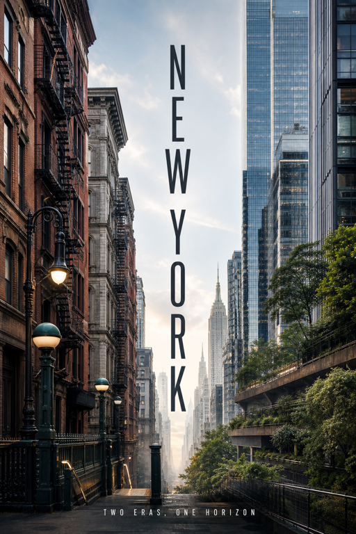
Define the city, the contrast between its two worlds, and one short tagline to build a connected vertical direction.
If your project needs a different visual structure, browse the ClearCrowds template library. For a broader look at instruction-based image work, read AI Image Editing with a Prompt.
Frequently asked questions
How do I make an AI-generated movie poster?
Reduce the story to one visual premise, then define a short title, subtitle, scene, and one symbolic accent. Generate a few directions and review text, anatomy, continuity, originality, and rights before using one.
What should I put in an AI movie poster prompt?
Describe the central scene, subject scale, emotional tension, palette, negative space, title hierarchy, and one meaningful symbol. Avoid long plot summaries and requests to copy an existing film campaign.
Can I use an AI-generated poster for a real film?
You can use AI for concept development if your tools, source material, contracts, and distribution plans allow it. Get the required legal and production review before public or commercial use.
Why does my AI movie poster look generic?
Generic prompts produce generic symbols. Replace broad words such as cinematic or epic with one specific scene, a clear subject scale, a limited palette, and a story-linked visual motif.
Sources
- Adobe Express movie poster maker
- Adobe Firefly movie poster generator
- ClearCrowds Minimal Cinematic Poster
Summary
An AI-generated movie poster works when the prompt behaves like a visual brief, not a plot summary. Choose one scene, define the title and subtitle, control subject scale and palette, and give one symbol a real story function. Then inspect the result like production key art: every letter, limb, reflection, credit, logo, and claim must earn its place.