How to Make an Art Exhibition Poster with AI

Poster template

Build an exhibition poster from four clear inputs

Enter the theme, main visual, title, and event details, then review the generated direction before you publish or print.

Use templateOpen guided workflowCreateReview the four passes
How to Make an Art Exhibition Poster with AI

Direct answer

To make an art exhibition poster with AI, reduce the show to four inputs: the exhibition theme, one main visual, a short title, and the essential event details. Generate a first direction from that brief, then judge it as a poster, not as an impressive image. The title must be readable, the artwork must remain the focal point, and every date, name, venue, logo, and access detail must be checked before the poster is shared or printed.

AI is most useful at the blank-page stage. It can connect the theme, material, composition, and mood into one visual direction. It should not make the final factual or production decisions for you.

Key takeaways

  • Start with one message and one hero visual. A poster cannot explain the whole exhibition.
  • Keep the first brief short: theme, main visual, title, and event details.
  • Use AI to explore a campaign direction, not to invent institutions, logos, artists, or event facts.
  • Check the poster at thumbnail size and at full size. It needs both immediate hierarchy and clean details.
  • Treat the generated image as a concept until print dimensions, bleed, color, rights, and text are verified.

What an art exhibition poster must communicate

An art exhibition poster is a public invitation built around the work. It has two jobs: make someone stop, then tell that person what to do next.

The stopping power usually comes from one strong image, material, object, or visual contrast. The practical information comes from a short hierarchy:

  1. Exhibition title
  2. Artist, group, or program name when needed
  3. Date or date range
  4. Venue
  5. One action, such as booking, visiting, or learning more

Not every detail belongs on the first poster. Curatorial notes, full biographies, sponsor lists, maps, and access information can move to an event page or a secondary layout. If the viewer cannot tell what the event is from a quick glance, more copy rarely fixes the problem.

Choose the right starting method

Starting methodBest whenWhat you control firstMain risk
Brief-driven AI conceptYou have a theme but no visual directionStory, hero visual, mood, and hierarchyAttractive output with wrong or invented details
Template builderYou already like a layout and need predictable editingType, colors, images, and element placementThe result can feel disconnected from the artwork if the layout leads the idea
Manual design or a designerThe campaign needs a full identity, exact production files, or many formatsThe complete visual systemMore time, budget, and coordination

These options can work together. You might generate a direction to find the visual idea, then rebuild the chosen direction in a layout tool for exact typography and print production.

Write a four-field exhibition brief

The brief should be specific enough to guide a composition but short enough to leave room for visual decisions.

Here is a complete example:

  • Exhibition theme: Indigo craft and natural dye
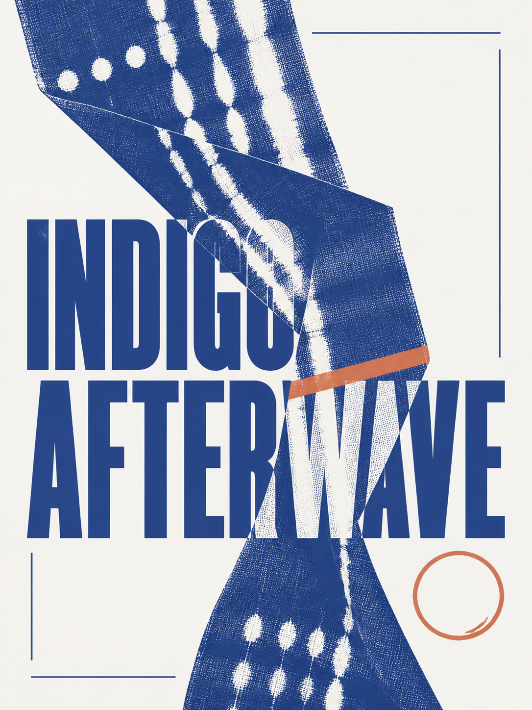
  • Main visual: Folded indigo-dyed linen with visible weave and tie-dye marks
  • Title: INDIGO AFTERWAVE
  • Event details: NATURAL DYE EXHIBITION, 2026

The theme gives the poster its subject. The main visual decides what carries the page. The title sets the verbal weight. The event line keeps the first generation focused.

If your main visual could mean almost anything, make it more concrete. "Textile art" is broad. "One folded indigo linen panel with visible weave and pale resist marks" gives the composition a center of gravity.

Do not put unconfirmed names, dates, venues, prices, or partner logos into an exploratory brief. Add factual details only when you can verify them.

An original two-color exhibition poster concept using indigo fabric and a restrained terracotta accent

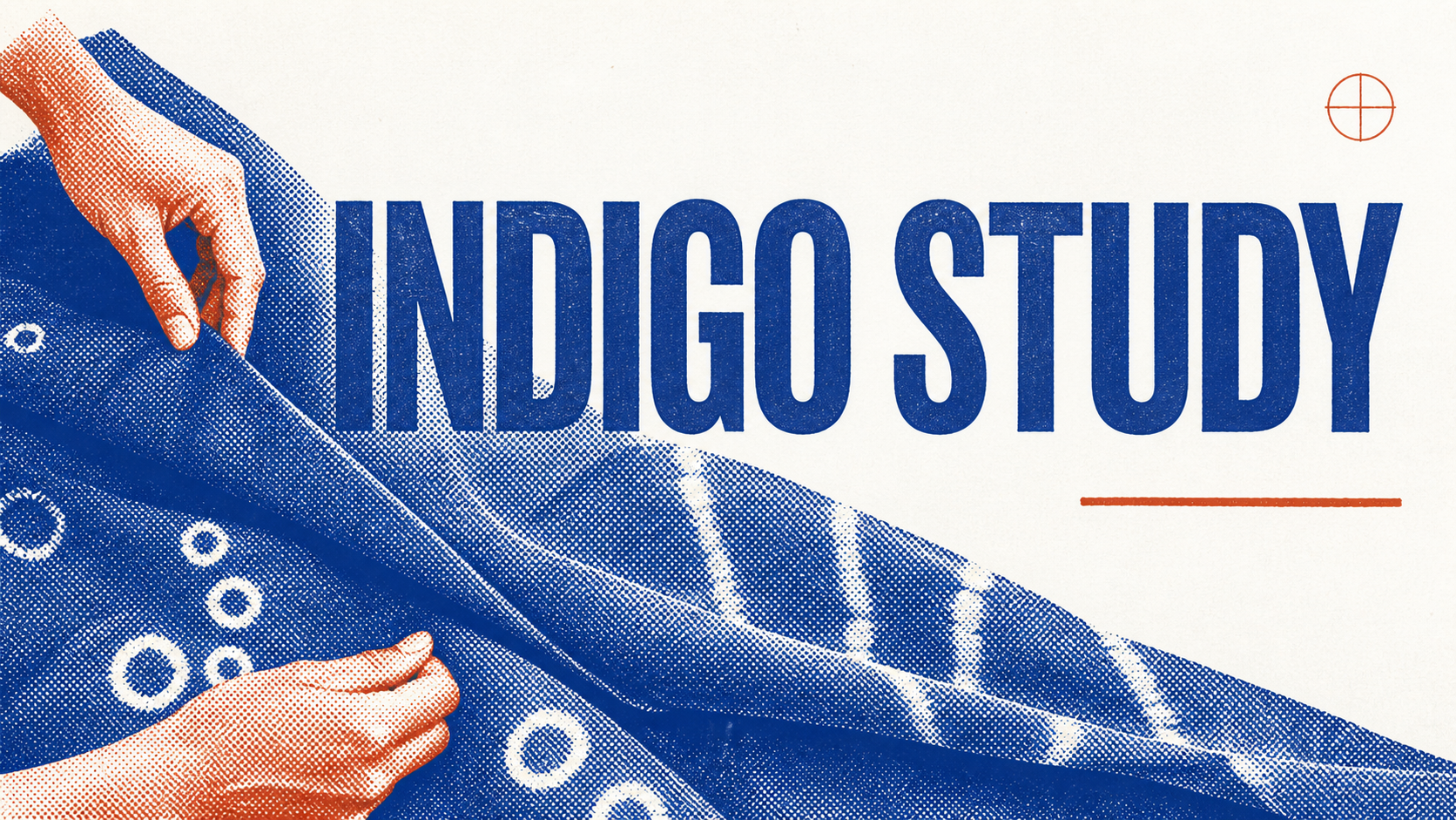
The images in this guide are editorial illustrations of the planning process and visual direction, not measured product outputs.

Generate the first poster direction

Once the brief is ready, ask for a single poster rather than a mood board, a social carousel, or a collection of variations. A narrow request makes the result easier to judge.

For a split-section composition, a useful direction is:

Create one vertical exhibition poster with two or three unequal visual regions. Use one folded indigo textile as the dominant object, let part of it cross a section boundary, keep the palette restrained, and leave generous space for a short title and event line. Do not invent institutions, logos, or extra copy.

The exact words matter less than the constraints. The brief establishes one subject, one compositional device, and a limited information load.

Generate a small set of directions, then compare them against the same questions:

  • Which option makes the artwork feel most important?
  • Can you find the title without searching for it?
  • Does the composition still work as a small social thumbnail?
  • Does the poster suggest the exhibition's material and mood without explaining everything?
  • Is there enough quiet space for verified event details?

Do not keep generating simply because none of the images feels finished. Identify the specific problem first. If the title has no space, revise the hierarchy. If the visual feels generic, sharpen the main visual. If the layout is busy, remove supporting objects rather than adding more style words.

Review the result in four passes

1. Hierarchy

Step back from the screen or reduce the poster to thumbnail size. You should see the hero visual first and the title second. Event details can be smaller, but they cannot disappear.

2. Artwork and visual integrity

Inspect material edges, hands, faces, frames, objects, patterns, and repeated details at full size. AI can create convincing texture from a distance while breaking the subject up close. If the poster uses an artist's work, use only material you have permission to reproduce and confirm that the generated treatment does not misrepresent it.

3. Text and facts

Compare every visible word with the approved event source. Check spelling, artist names, date range, opening time, venue, address, ticket information, and web address. Generated letterforms may look plausible without being correct. Replace or rebuild any text that cannot be verified.

4. Production

Before print, confirm the final size, resolution, bleed, safe area, color requirements, paper choice, and export format with the printer. A beautiful screen image is not automatically a production file. For social use, check the important content in each intended crop rather than assuming one vertical file will work everywhere.

If you later discover a wrong date in a flattened poster, use the narrow correction process in How to Fix the Wrong Date on an Event Poster Photo. Do not use that repair workflow as a substitute for checking the source file.

How this differs from browsing poster templates

A template library starts with layout choice. For example, Canva's art poster templates let you choose a premade design and customize its colors, fonts, graphics, and event information. That is useful when you want a visible structure before deciding on the content.

A brief-driven workflow starts in the opposite order. You define the exhibition's theme, hero visual, title, and key facts first, then generate a composition around them. It is useful when the artwork or curatorial idea should shape the layout rather than fit into one you selected earlier.

Neither route removes the need for judgment. Template tools still require choices about hierarchy and relevance. Generated concepts still require factual, visual, and production review.

Where ClearCrowds fits

ClearCrowds' Split-Section Exhibition Poster workflow asks for the same four inputs used in this guide: exhibition theme, main visual, title, and event details. It builds a vertical direction around unequal sections, one dominant object, material detail, and controlled negative space.

Use it when the blank page is the problem and you want to test a composed direction quickly. Treat the result as campaign concept art. Check the generated text, replace unverified details, add only authorized logos, and prepare the final production file to the printer's specifications.

Build an exhibition poster from four clear inputs

  • Brief first
  • One hero visual
  • Review every detail
Photo before build an exhibition poster from four clear inputs
An art exhibition brief developed into a split-section poster concept
قبلبعد

Enter the theme, main visual, title, and event details, then review the generated direction before you publish or print.

For an exhibition led by cultural context, performance, or a strong typographic idea, try a more editorial composition instead.

Frame a cultural subject as an editorial poster

  • Specific subject
  • Strong type
  • Culture check
Photo before frame a cultural subject as an editorial poster
Cultural editorial poster template with large type and geometric figures
قبلبعد

Combine one specific cultural theme, a large title, a clear figure action, and a restrained symbolic palette.

You can also browse the [ClearCrowds template library](/templates) if another poster structure suits the project better.

Frequently asked questions

What should an art exhibition poster include?

Include a clear exhibition title, one main visual, the date, venue, and only the event details a viewer needs to act. Add verified artist, organizer, ticket, and access information when relevant.

Can AI make an art exhibition poster from a written idea?

Yes. A focused brief can produce a useful first direction, but you still need to check every name, date, venue detail, logo, artwork right, and print requirement.

Should I use a template or generate a poster with AI?

Use a template when you already like a layout and want direct control over each element. Use a brief-driven AI workflow when you need a visual direction built around your theme and hero image.

Is an AI-generated exhibition poster ready to print?

Treat it as a campaign concept until you have checked dimensions, resolution, bleed, color settings, text accuracy, logos, and artwork permissions with your printer or production team.

Sources

Summary

A useful art exhibition poster begins with a strict brief, not a pile of style references. Define the theme, one hero visual, a short title, and essential event details. Use AI to find a visual direction, then do the work that makes the poster trustworthy: verify the facts, protect the artwork, correct the text, and prepare the file for its real format.

تحميل التطبيق

احصل على ClearCrowds على iOS أو Android، ثم قم بتنظيف الصور وحفظها ومشاركتها من هاتفك.